![]()
We love it.
But, it wasn’t easy.
Despite the seeming simplicity of that cool font and stacked name, our logo design brought weeks of anxiety, anger and joy (in that order) as we watched our company be expressed visually for the first time.
It took about 6 weeks of work with a small (but mighty) design agency in Boston. The first 3 of which brought the anxiety and anger. And since it was a visual journey with a bunch of iterations along the way, I’ve laid out a timeline with the different design versions below. Also, I’ve included the key ideas that inspired changes so you can follow how the whole process ended with joy and how we landed on a logo we love.
Weeks 1 – 2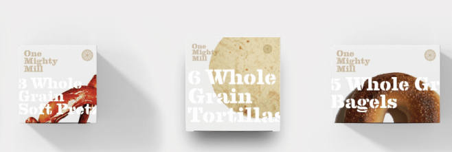 Team One Mighty Mill wrote a Brand Brief that tried to define our value proposition, story, audience, personality, and position in the market. Next, our agency led meetings to evaluate other brand designs and create story boards. Obviously, we didn’t provide the clearest direction. Those initial renderings above tell you that we missed the mark. Those packages would be fine for just another, premium-feeling-but-generic brand in grocery stores. So, while it’s really hard to articulate feedback for look and feel, we knew that this was NOT how One Mighty Mill was supposed to look or feel. But, despite the disappointment, our design review forced us to articulate why OMM mattered and why it was different. So, in that meeting, we realized the power of simply stating where our wheat was grown and our flour was milled (i.e. “Grown in Linneus, Maine” and “Ground in Lynn, MA”). Those real places give OMM the power to truly disrupt the category, to clearly stand up and say something that matters and is real. We’d use them going forward.
Week 3 This next iteration was a step in the wrong direction. (This is when the anger and anxiety was highest.) While we added the “grown in” and “ground in” language, it still wasn’t right. I actually started to think that we may need to blow it all up and start over with new design partners and new discovery process. (I ended up being completely wrong!)
Weeks 4 – 5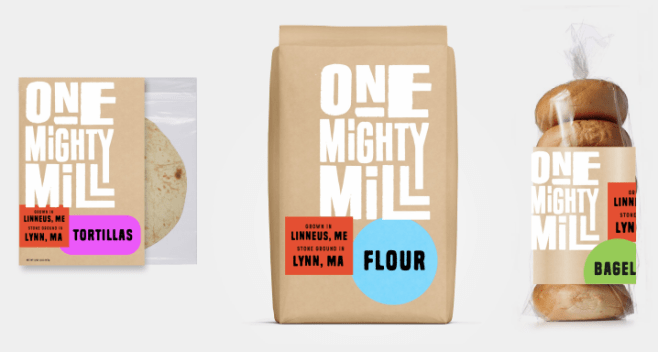 We regrouped and provided really thorough feedback to our design partner. The overall message was that we needed to go more BOLD. Not bold that tries too hard. But, bold that conveys authenticity, challenges the category norm, and pops off the shelf. Be bold, fun, quirky, authentic, and friendly — a little less premium than our first 2 rounds. We gravitated towards the simpler designs in mood boards we reviewed. So, the most important directive — be bold through simplicity. As you can see in the above, we started to figure it out.
Week 6 We provide a final round of detailed feedback and changes. This time, we nailed it. The dream is real. In week #6 of design, there was joy at One Mighty Mill.
